After the pandemic, schools across the country were faced with hard truths: academic scores fell, student needs grew more complex, and boards needed answers. At Los Banos Unified School District, leadership chose not to sugarcoat the situation. Instead, they leaned into the data and used it to reshape the conversation. Telling data stories to school boards is the first step to success.
In a recent Parsec Education webinar Chief Academic Officer, Sean Richey and Coordinator of Assessment and Accountability, Karen Ellington, shared how they communicated their district’s post-pandemic performance to their board using Parsec Analytics dashboards. Their strategy wasn’t about hiding poor results. It was about adding context, choosing fair comparisons, and staying action-focused with the right tools to back them up.
Here’s how they did it and how other districts can follow the same path. If you like this topic and what we talk about, subscribe to our biweekly newsletter, out every Thursday!
The Challenge: How to Share What’s Real
Los Banos, like many school systems, had seen their state test results drop after the pandemic.
“Our scores tanked,” Sean explained. “We had been on the up and up and then after the pandemic, it was like a 10% drop in meets and exceeds standard for almost everything.”
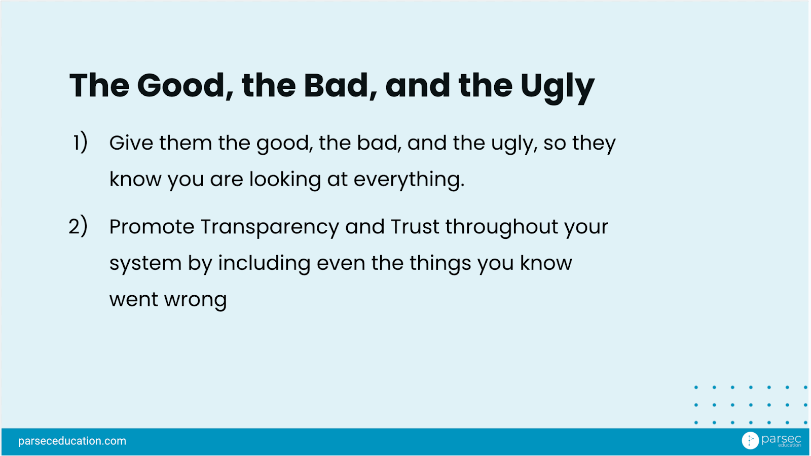
On top of that, after reviewing results from the California Healthy Kids Survey, they saw troubling trends in school climate indicators like chronic sadness and lack of connectedness. Los Banos knew they needed to bring the full picture to their board, but how do you do that without overwhelming them or making the school look bad?
Rather than rely on static score reports or statewide comparisons that could feel misleading or disheartening, Karen and Sean used tools that let them frame the data in context.
Using CAASPP Rankings to Reframe the Conversation
The team turned to Parsec’s CAASPP Dashboard, specifically its ranking tool, to change how their board viewed the district’s results.
Initially, their scores were compared against all districts across California, which is over 1,000 in total. Unsurprisingly, Los Banos did not rank near the top. But that was only part of the story.
With the dashboard, they filtered down their comparison group to include only:
- Unified school districts
- Over 10,000 students
- 70% or more of students qualifying for free or reduced-price lunch
- 20% or more English learners
When those parameters were applied, the number of comparison schools dropped from over 1,000 to just 32.
That change created clarity. Rather than feeling like they were far behind “everyone,” Los Banos could now show how they were performing alongside schools with similar challenges and demographics. It changed the tone of the board discussion and opened the door for problem-solving. Within the 32 schools, they were now in the middle of the pack, not at the bottom.
Grounding It In Action
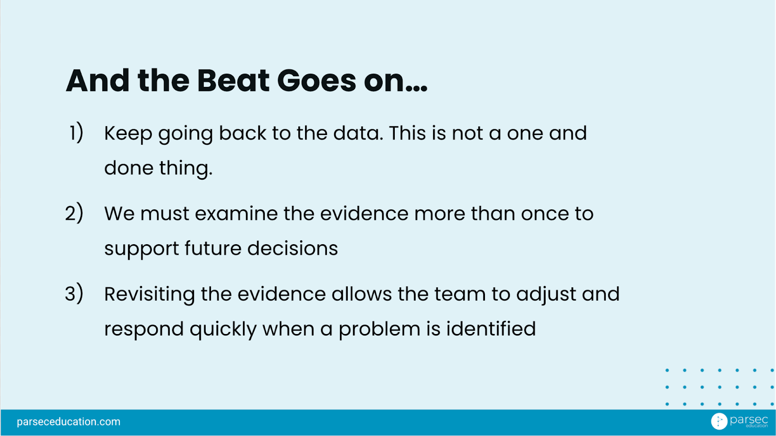
Sean emphasized that their presentations to the board wasn’t just about explaining data but they were tied to strategy and follow-through.
“The whole point of data is to move the needle, to make you take the next step, to try to do something. So there should always be an action associated… or use this as a ‘hey, here’s how we’re monitoring some of the actions we’re already doing.’”
That mindset helped guide their presentation structure. They didn’t just show what the data said, they included what they were doing about it.
They used board meetings to:
- Show updated trends using consistent metrics
- Tie each data point to a program, intervention, or planned next step
- Give the board confidence that leadership was learning, adjusting, and moving forward
“Link it to something you’re doing or something you want to do, because that will help you make progress with where you’re going. It also helps build goodwill with the board.” Sean said.
They also spaced the updates throughout the year connecting them to LCAP cycles and avoiding long, overwhelming data dumps.
What You Can Do
If your school or district is preparing to share tough data with your board, here’s a simple framework you can follow based entirely on what Los Banos did.
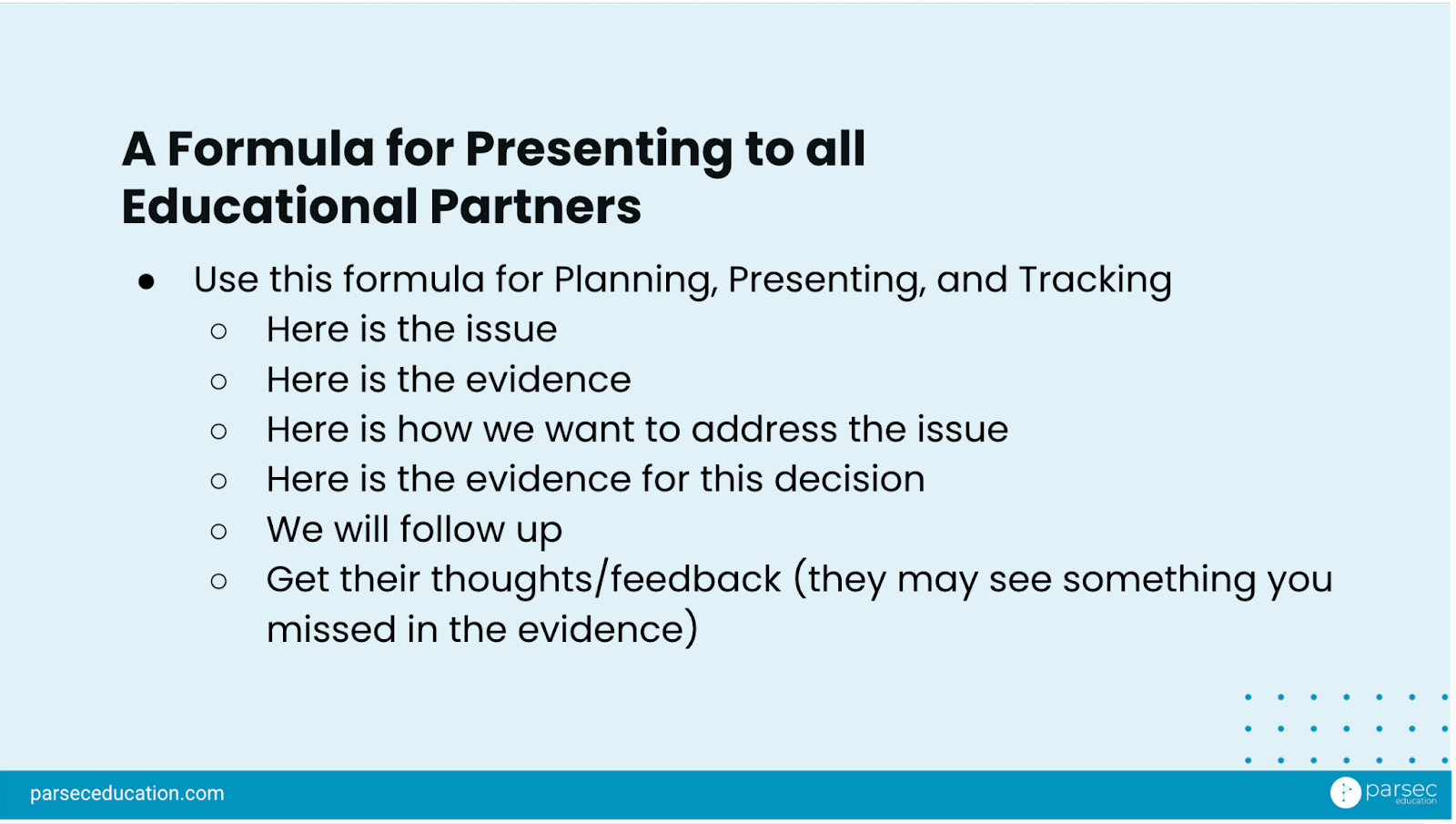
Want to Make Your Board Presentations Even Stronger?
Los Banos focused on academic and school climate data, but many schools are now going a step further: bringing in student voices to deepen the story. Here’s some steps you can take to build your board story:
Step 1: Ask open-ended questions
Start with one or two broad prompts like,
“What’s helping you at school right now?” or
“What’s something that could make your day better?”
Embed them into systems you already use, like check-ins, classroom circles, or advisory time.
💡 Why this matters:
Adding questions to existing structures makes it easy for staff to collect feedback regularly. It also keeps the student voice grounded in day-to-day school life, not just a one-time collection.
Step 2: Look for patterns
Use a tool like Parsec Real to sort open-ended responses by theme. What’s showing up across schools or grade levels? What do students keep bringing up?
💡 Why this matters:
One comment can be powerful. But repeated themes tell your board: “This is a system-wide issue.” It helps them zoom out and connect individual stories to bigger trends.
Step 3: Link it to your goals
Frame student voice data alongside your existing academic or climate metrics. For example, if you’re working to improve school connectedness, highlight student feedback about relationships and belonging.
💡 Why this matters:
It shows your board how this feedback ties into your existing LCAP or site goals and it keeps the conversation grounded in your real priorities.
Step 4: Share stories, not just stats
Include direct student quotes. Not a summary, not a paraphrase. Let leadership teams and board members hear students’ own words.
💡 Why this matters:
Numbers show outcomes, but stories show impact. The combination helps your board understand what’s really going on and why it matters.
Key Takeaways
- Los Banos used Parsec’s CAASPP dashboard to reframe their performance story with fair, filtered comparisons
- Their board conversations improved when data was tied to action, not just reporting
- Sharing frequent, clear updates built trust and created space for long-term solutions
Want to Do This at Your School?
Parsec’s Analytic Dashboards, specifically the Ranking Tool, helps you present your data in context, compare with true peers, and keep your leadership team and board aligned on what matters most.
Interested in checking out how our dashboard can support your story today? Let’s chat!