
This is a title
Interpreting Public-Data Rankings with Parsec Clarity (what it shows, and what it doesn't)
Watch the tutorial
Why this matters
Pulling up a ranking is easy. Knowing what it's actually telling you is the harder part. This article walks through how to read what Rankings shows you, why comparing yourself to the state average or your nearest neighbor can be misleading, and how to use the tool to set realistic goals and find districts worth learning from.
Who it's for
- District administrators writing LCAP goals or preparing board and community updates
- No prior experience with the platform is required
Step-by-step
Pull up a district and see what's returned
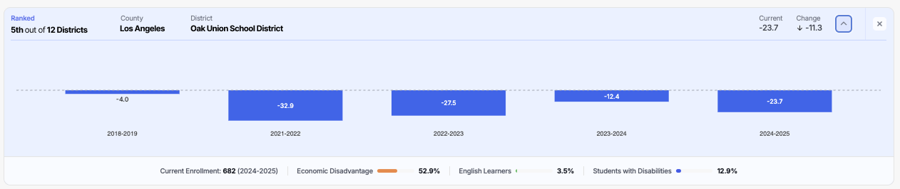
From Rankings, select an agency like your School District or Charter School. You'll see:
- Their rank by the default metric (Distance from Standard in English Language Arts)
- Their current value and change from the previous year
- Enrollment size
- The three largest student groups in the data set
- A trend view, available by clicking the down caret
Understand why "closest" isn't the same as "most similar"
The reason this tool exists is to move you away from comparing yourself to your nearest neighbor or to the state average — and toward comparing yourself to districts that are actually like you.
For example, a district might have 90% economically disadvantaged and get compared to another district with 25% economically disadvantaged just because they are neighboring communities. But that's not an apples-to-apples comparison.
Switch metrics and views as needed
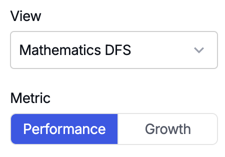
You can change from Distance from Standard to Percent Proficient (from the CAASPP Research File), and toggle between performance and growth. Leaving the agency level at district and the subject at English Language Arts keeps the comparison consistent while you explore.
Filter to a specific student group to see targeted performance
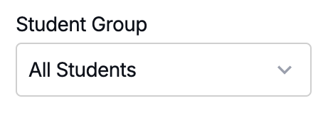
Selecting a student group — for example, economically disadvantaged students — narrows the list to districts that report enough of that group to produce data. Rank can shift significantly once you isolate a group this way, which often reveals strong performance that a district-wide rank was masking.
The academic/non-academic filter doesn't need adjusting — that's already determined by the metric you picked (for example, ELA vs. graduation rate).
Narrow by demographic range, but don't over-narrow
Use the English Learner percentage filter (for example, 15%–35%) to compare against districts with a similar population. Watch the size of your remaining list as you add filters — if you stack too many narrow ranges at once, you can end up with too small a group to make a meaningful comparison. It's usually worth skipping a filter (like students with disabilities) if adding it would shrink the field too far.
Watch for structural differences that skew comparisons
If the districts ranked above you have "High" in their name, take a closer look — high school districts often only test 11th grade, which is the highest-proficiency grade span in ELA. That makes them an unfair comparison against a K–12 or unified district. Filtering District Type to Unified School Districts removes this kind of mismatch.
Adjust for size
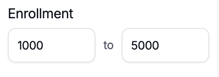
Even after narrowing by demographics and district type, check enrollment. Two districts can both be performing well while being very different sizes — add enrollment as a column to confirm you're still comparing apples to apples.
How to use what you find
Once you've narrowed the list to districts that are genuinely similar to yours, there are a few ways to put that to use:
- Identify districts worth reaching out to — if a similar district is outperforming you, it may be worth contacting them directly to learn what they're doing
- Support board and community communication — this data is FERPA compliant and can be shared to show your board or community how your district compares to genuine peers, not just the state average
If you have questions on how to use this tool or interpret the data, reach out to your LIS — they'll have further information.
Was this article helpful?
What was missing?